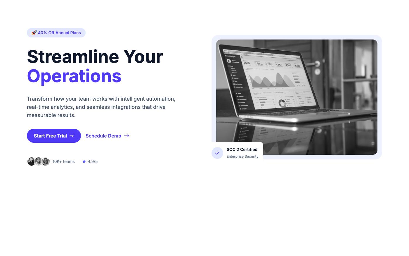
A landing page isn't just a collection of sections — it's a persuasion sequence. Each element has a job. Here's the anatomy of pages that actually convert, with Tailwind CSS examples for each part.
Above the Fold: The 5-Second Test
Visitors decide whether to stay or leave in about 5 seconds. Above the fold, you need:
- Clear headline — What do you offer? (benefit, not feature)
- Supporting text — Who is it for and why should they care?
- Primary CTA — One clear action to take
- Visual proof — Screenshot, mockup, or relevant image
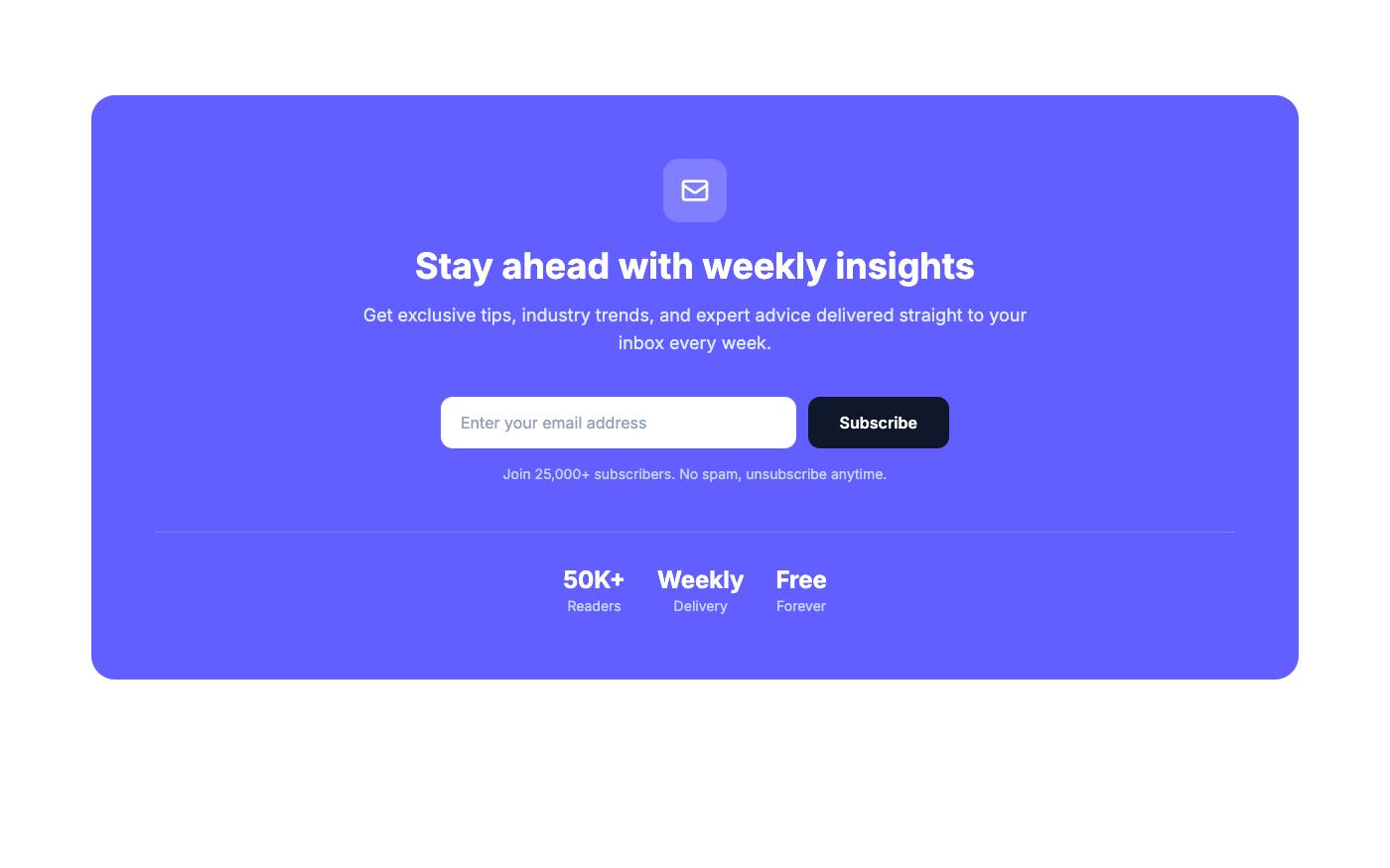
Social Proof: Reduce Anxiety
Right after the hero, show that others trust you. This reduces the "am I making a mistake?" anxiety. Options:
- Client logos (most common)
- User count ("Join 50,000+ developers")
- Star ratings from review platforms
- Media mentions ("As seen in...")
Benefits, Not Features
Features tell what your product does. Benefits tell what it does for the user. Always lead with benefits.
| Feature (Weak) | Benefit (Strong) |
|---|---|
| Automated reporting | Save 10 hours every week |
| Real-time collaboration | Ship projects 2x faster with your team |
| 256-bit encryption | Your data is safer than a bank vault |
| 99.9% uptime SLA | Your site never goes down |
Visual Hierarchy: Guide the Eye
Use size, color, and spacing to create a clear reading path:
- Headline — Largest text on the page (
text-4xltotext-6xl) - Supporting text — Medium size, muted color (
text-lg text-neutral-600) - CTA button — Accent color, stands out from everything else
- Section headers — Clear hierarchy (
text-2xltotext-3xl)
CTA Placement: The Rule of Three
Place your primary CTA in at least three locations:
- Hero section — For visitors who are ready immediately
- After features/benefits — For visitors who needed more info
- Final CTA section — For visitors who read everything
💡 Pro tip: Don't make users hunt for the action button. Every scroll position should have a CTA visible or nearby. Browse CTA blocks on OpenTailwind for inspiration.
The Conversion Killers
- Too many CTAs — One primary action per page. "Start Free Trial" everywhere, not "Start Trial" + "Book Demo" + "Contact Sales" + "Download PDF"
- Weak headlines — "Welcome to our platform" converts nobody. Lead with the benefit.
- No social proof — If you don't show that others trust you, visitors won't either
- Slow loading — Every second of load time costs conversions. Optimize images, minimize JavaScript