You've heard it before: "Every Tailwind site looks the same." There's some truth to it — but it's not Tailwind's fault. It's a design problem, not a framework problem. Here's how to fix it.
Why It Happens
Tailwind's defaults are good. So good that developers use them as-is: rounded-lg, shadow-md, text-gray-600, bg-white. When everyone uses the same defaults, everything looks similar.
The same thing happened with Bootstrap for years. The framework isn't the problem — the lack of intentional design decisions is.
Fix 1: Choose a Real Color Palette
Stop using gray and blue as your only colors. Pick one accent color and commit to it. Amber, rose, teal, violet — anything that gives your site personality.
<!-- Generic (looks like every other site) -->
<button class="bg-blue-500 text-white rounded-lg">Get Started</button>

<!-- Intentional (has personality) -->
<button class="bg-amber-600 hover:bg-amber-700 text-white rounded-full">Get Started</button>
Fix 2: Typography Matters More Than You Think
Inter is everywhere. Try something different: Instrument Sans, Plus Jakarta Sans, Outfit, or Satoshi. A different font instantly changes the feel.
Also: vary your font sizes more aggressively. A text-6xl headline with text-base body text creates better hierarchy than text-3xl with text-sm.
Fix 3: Spacing Creates Luxury
Generous whitespace makes designs feel premium. Don't be afraid of py-24 or gap-16. Cramped layouts feel cheap.
Fix 4: Use Real Images
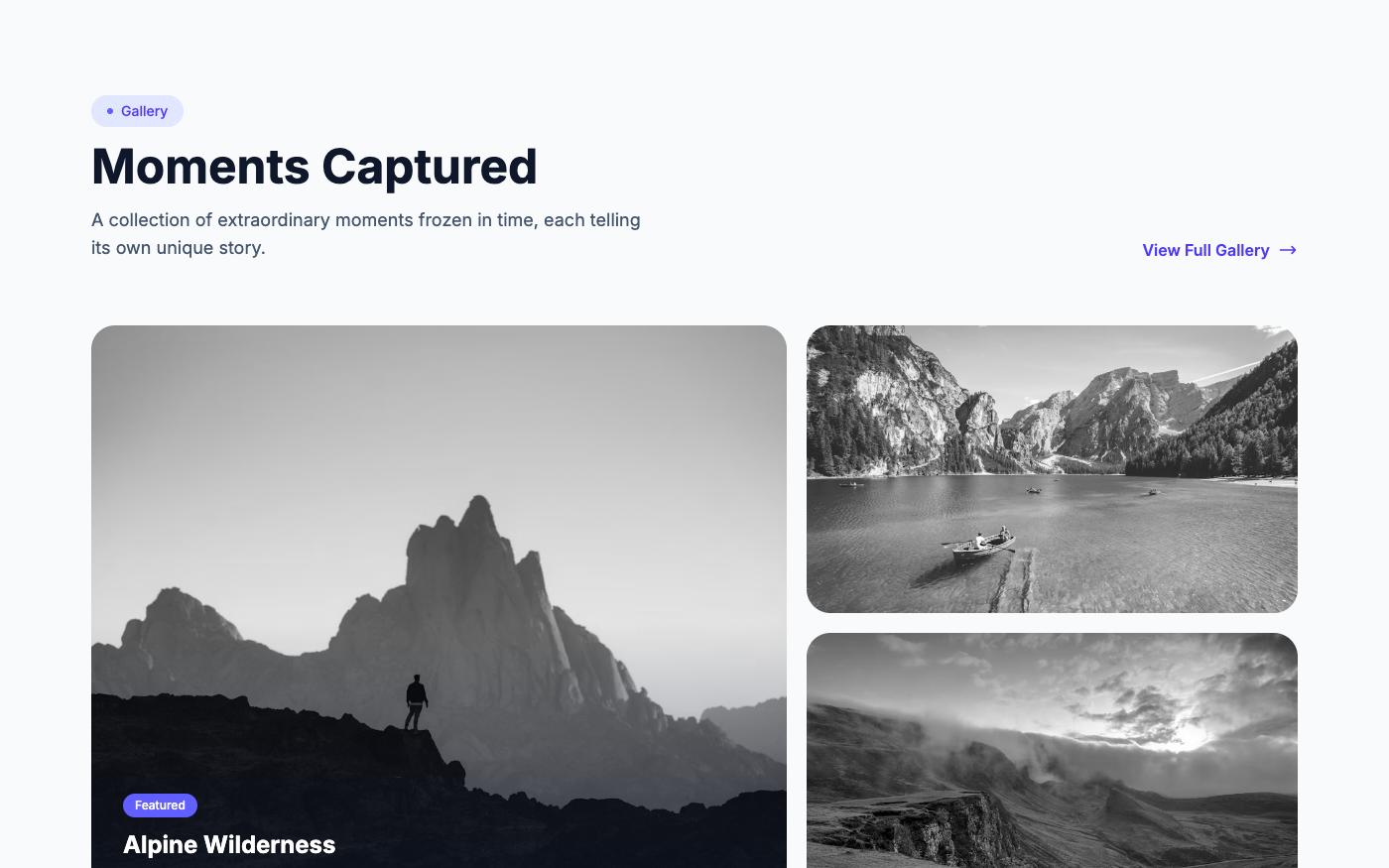
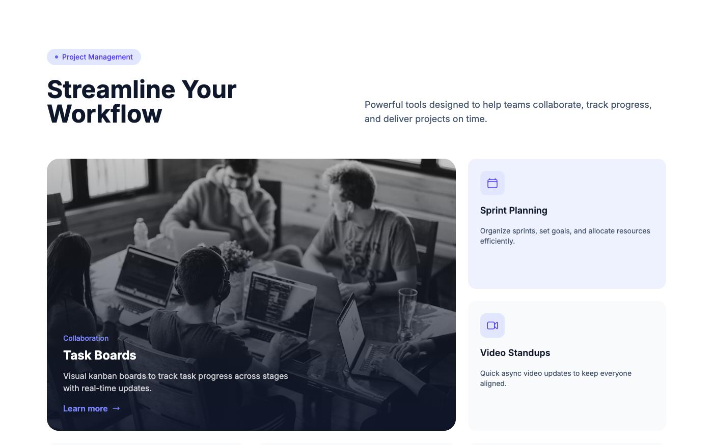
Generic stock photos kill uniqueness faster than anything. Use contextually relevant images from Pexels or Unsplash that match your brand's story.
Fix 5: Break the Grid
Not everything needs to be a 3-column grid. Try asymmetric layouts, bento grids, overlapping elements, or magazine-style compositions.
💡 Pro tip: Browse OpenTailwind's 1,761 blocks across three design versions (Pro, Fresh, Classic) to see how the same content can look completely different with different layout and color choices.
Tailwind gives you the tools. The design decisions are yours. Make them intentionally.