We looked at 100 SaaS landing pages — from early-stage startups to billion-dollar companies. The pattern is remarkably consistent. Here are the seven sections that appear on virtually every one.
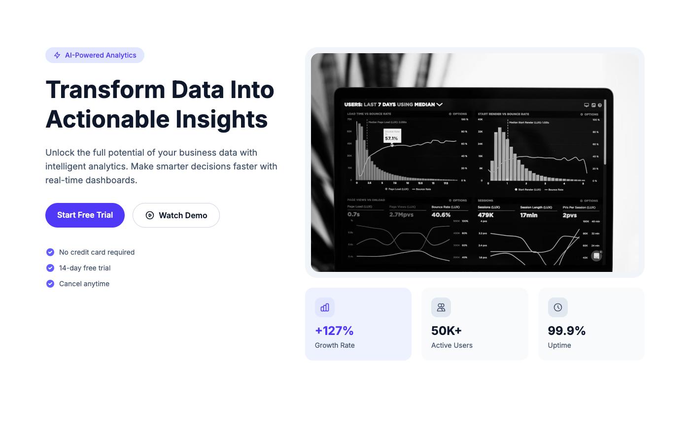
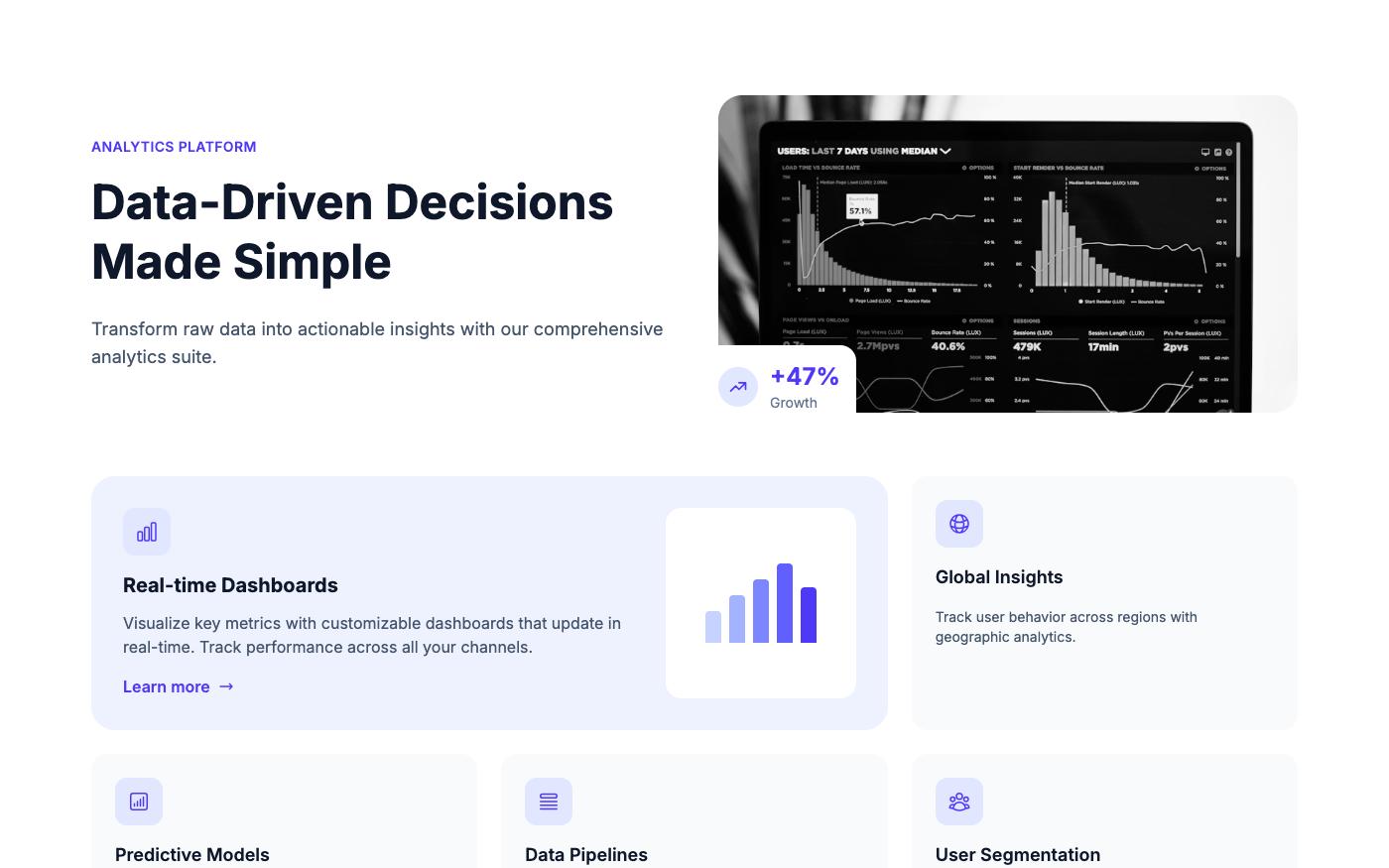
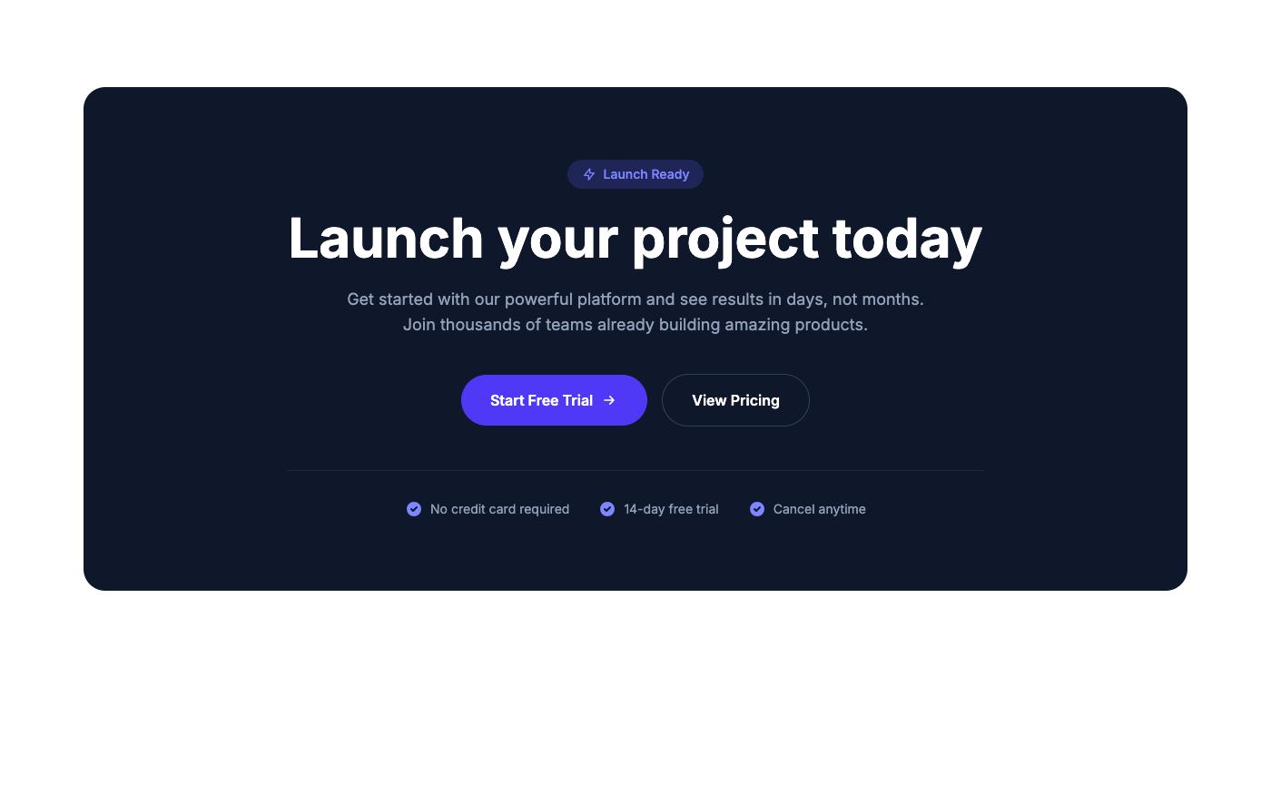
1. Hero Section (100% of pages)
Every single page starts with a hero. The formula: benefit-driven headline (under 10 words), supporting paragraph (1-2 sentences), primary CTA, and a product visual (screenshot, mockup, or illustration).
The best heroes show the product in action. A dashboard screenshot beats a stock photo every time.
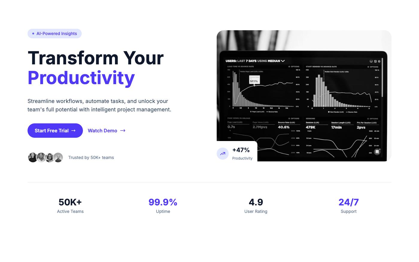
2. Social Proof (89% of pages)
Client logos, user counts, or trust badges — usually right below the hero. "Trusted by 10,000+ teams" with 5-6 recognizable logos. Simple but effective.
3. Features/Benefits (97% of pages)
3-6 key features with icons and short descriptions. The best pages focus on benefits ("Save 10 hours/week") rather than features ("Automated reporting").
4. Testimonials (78% of pages)
Customer quotes with real names, titles, and photos. Carousel or grid layout. The most effective testimonials include specific results ("Increased conversion by 40%").
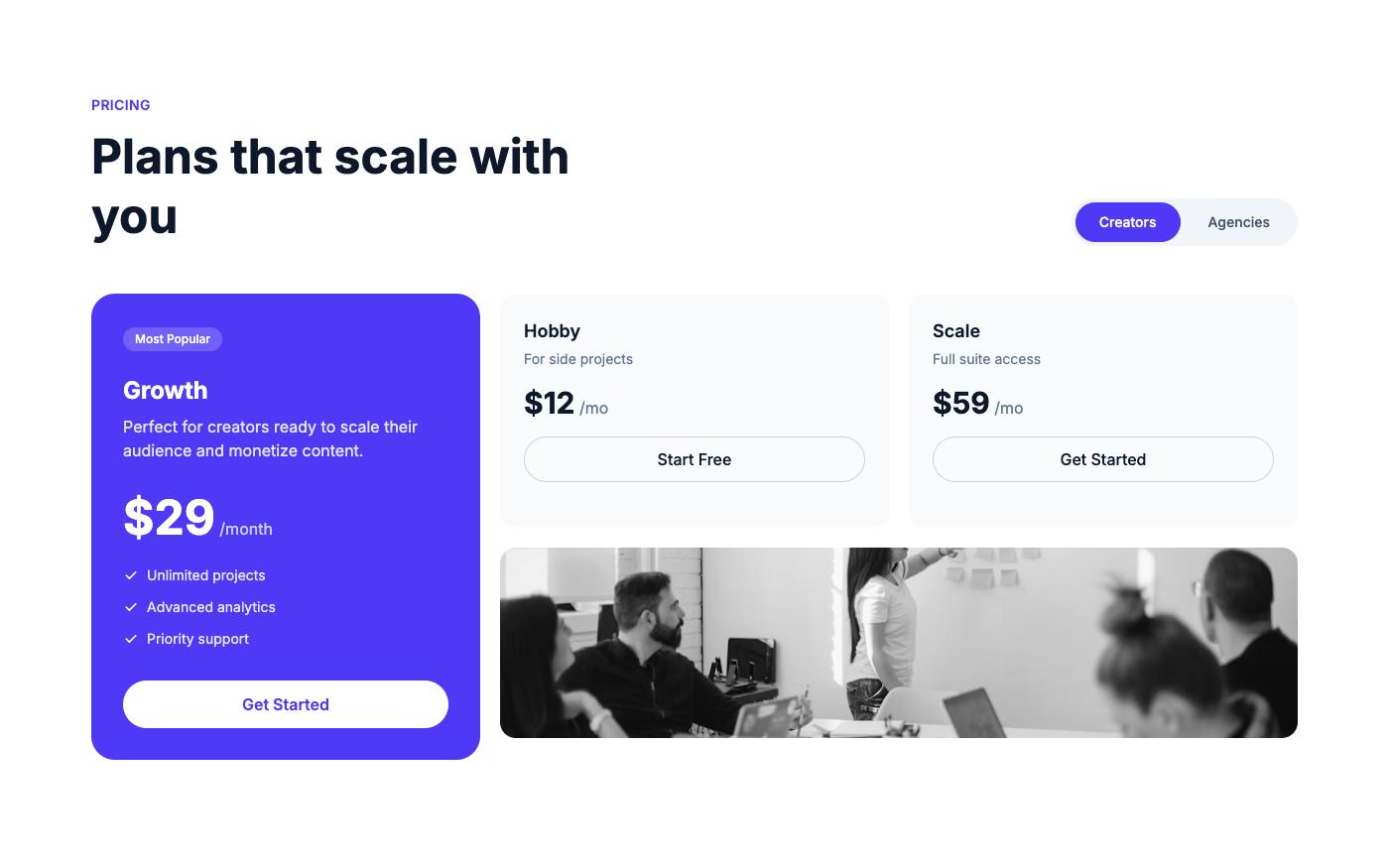
5. Pricing (72% of pages)
2-3 plans with clear differentiation. Monthly/yearly toggle. One plan highlighted as "recommended" or "most popular." Free tier or trial prominently featured.
6. FAQ (61% of pages)
5-8 questions addressing common objections: pricing, security, migration, support, cancellation. Accordion layout is standard.
7. Final CTA (84% of pages)
A dedicated CTA section near the footer — catches visitors who scrolled the entire page. Usually simpler than the hero: headline + single button.
The Takeaway
You don't need to reinvent the wheel. These seven sections work because they follow the natural decision-making process: attention → interest → trust → action. Start with this structure, then customize for your specific product and audience.
💡 Pro tip: OpenTailwind has blocks for every one of these sections. Build a complete SaaS landing page by picking one block from each category — browse the library.