
Dark Portfolio Tailwind CSS Template
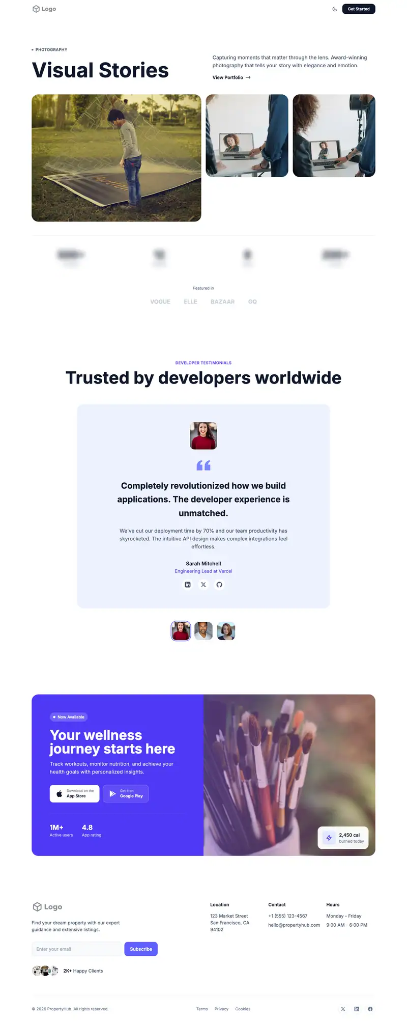
A dark portfolio landing page template from the Portfolio Creative collection, built with Tailwind CSS v4: navigation, hero, testimonials, call to action and footer, responsive at sm/md/lg with dark mode.
Preview & customizeIncluded with a Free account. Sign in to copy or download. Compare access · Open the live demo
 Open the live demo
What's on the page
- Navigation — Minimal Clean layout (
#_header_minimal_clean_h1_001) - Hero — Photography Portfolio layout (
#_hero_photography_portfolio_v6_001) - Testimonials — Centered Social layout (
#_testimonial_centered_social_v6_t36_001) - Call to action — Colored App Banner layout (
#_cta_colored_app_banner_v6_001) - Footer — Subscribe Contact layout (
#_footer_subscribe_contact_v6_001)
Technical details
- Sections: 5
- Built with: Tailwind CSS v4 utility classes, plain HTML
- Breakpoints: sm, md, lg
- Dark mode: Yes, 24 dark: utilities
- Distinct utility classes: 219
- Images: 15
- JavaScript: Small inline script (menu or carousel)
- HTML size: 32 KB
Hero section code
The first screen of this free template, as it ships. Sign in to copy the full page.
<section id="_hero_photography_portfolio_v6_001" class="py-20 sm:py-24 bg-white dark:bg-neutral-950">
  <div class="max-w-7xl mx-auto px-4 sm:px-6 lg:px-8">
    <div class="grid lg:grid-cols-2 gap-8 lg:gap-16 items-end mb-12">
      <div data-motion="hero" class="space-y-6">
        <span data-motion="badge" class="inline-flex items-center gap-2 text-slate-600 dark:text-neutral-400 text-sm font-semibold tracking-wide uppercase">
          <span class="w-1.5 h-1.5 bg-slate-500 rounded-full"></span>
          Photography
        </span>
        <h1 class="text-5xl sm:text-6xl lg:text-7xl font-bold text-slate-900 dark:text-white leading-[1.05]">
          <span data-animate="heading">Visual</span>
          <span data-animate="heading"> Stories</span>
        </h1>
      </div>
      <div data-motion="card" class="space-y-4">
        <p data-animate="text" class="text-lg text-slate-600 dark:text-neutral-400">
          Capturing moments that matter through the lens. Award-winning photography that tells your story with elegance and emotion.
        </p>
        <a data-motion="button" href="#" class="inline-flex items-center gap-2 text-slate-900 dark:text-white font-semibold hover:gap-3 transition-all duration-300">
          View Portfolio
          <svg class="w-5 h-5" fill="none" stroke="currentColor" viewBox="0 0 24 24">
            <path stroke-linecap="round" stroke-linejoin="round" stroke-width="2" d="M17 8l4 4m0 0l-4 4m4-4H3"/>
          </svg>
        </a>
      </div>
    </div>
    <div class="grid grid-cols-4 gap-4 mb-12">
      <div data-motion="image" class="col-span-2 rounded-3xl overflow-hidden aspect-4/3">
        <img data-motion="image" src="https://images.unsplash.com/photo-1760071744047-5542cbfda184?ixid=M3wzOTQxMzN8MHwxfHNlYXJjaHwxfHxjcmVhdGl2ZSUyMHBvcnRmb2xpbyUyMGFydGlzdGljfGVufDF8MHx8fDE3NjkzMTg1OTF8MA&ixlib=rb-4.1.0&w=1200&auto=format&fit=crop&q=80" alt="Mountain landscape" class="w-full h-full object-cover">
      </div>
      <div data-motion="image" class="rounded-3xl overflow-hidden aspect-square">
        <img data-motion="image" src="https://images.unsplash.com/photo-1758613654472-7d0f611c1b82?ixid=M3wzOTQxMzN8MHwxfHNlYXJjaHwyfHxjcmVhdGl2ZSUyMHBvcnRmb2xpbyUyMGFydGlzdGljfGVufDF8MHx8fDE3NjkzMTg1OTF8MA&ixlib=rb-4.1.0&w=1200&auto=format&fit=crop&q=80" alt="Portrait" class="w-full h-full object-cover">
      </div>
      <div data-motion="image" class="rounded-3xl overflow-hidden aspect-square">
        <img data-motion="image" src="https://images.unsplash.com/photo-1758613654800-26e7f2706fbf?ixid=M3wzOTQxMzN8MHwxfHNlYXJjaHwzfHxjcmVhdGl2ZSUyMHBvcnRmb2xpbyUyMGFydGlzdGljfGVufDF8MHx8fDE3NjkzMTg1OTF8MA&ixlib=rb-4.1.0&w=1200&auto=format&fit=crop&q=80" alt="Nature" class="w-full h-full object-cover">
      </div>
    </div>
    <div class="w-full h-px bg-slate-200 dark:bg-neutral-800 mb-12"></div>
    <div class="grid grid-cols-2 md:grid-cols-4 gap-8">
      <div data-motion="card" class="text-center">
        <span class="text-4xl font-bold text-slate-900 dark:text-white block">500+</span>
        <span class="text-slate-500 dark:text-neutral-400 text-sm">Projects</span>
      </div>
      <div data-motion="card" class="text-center">
        <span class="text-4xl font-bold text-slate-900 dark:text-white block">12</span>
        <span class="text-slate-500 dark:text-neutral-400 text-sm">Awards</span>
      </div>
      <div data-motion="card" class="text-center">
        <span class="text-4xl font-bold text-slate-900 dark:text-white block">8</span>
        <span class="text-slate-500 dark:text-neutral-400 text-sm">Years</span>
      </div>
      <div data-motion="card" class="text-center">
        <span class="text-4xl font-bold text-slate-900 dark:text-white block">200+</span>
        <span class="text-slate-500 dark:text-neutral-400 text-sm">Clients</span>
      </div>
    </div>
    <div data-motion="social-proof" class="mt-16 text-center">
      <p class="text-slate-500 dark:text-neutral-400 text-sm mb-6">Featured in</p>
      <div class="flex flex-wrap justify-center items-center gap-12 opacity-50">
        <span class="text-xl font-bold text-slate-400 dark:text-neutral-600">VOGUE</span>
        <span class="text-xl font-bold text-slate-400 dark:text-neutral-600">ELLE</span>
        <span class="text-xl font-bold text-slate-400 dark:text-neutral-600">BAZAAR</span>
        <span class="text-xl font-bold text-slate-400 dark:text-neutral-600">GQ</span>
      </div>
    </div>
  </div>
</section>
From template to your website
Open the editor to try colors, fonts, and screen sizes, then sign in with an account that includes this template to copy or download its HTML. It needs Tailwind CSS v4 and, for the dark theme, @custom-variant dark (&:where(.dark, .dark *));.
Text, images, and testimonials are placeholders. Replace them, and connect forms or booking to your own services before publishing. Usage is covered by the OpenTailwind license.
More portfolio & creative templates.
All Portfolio & creative templates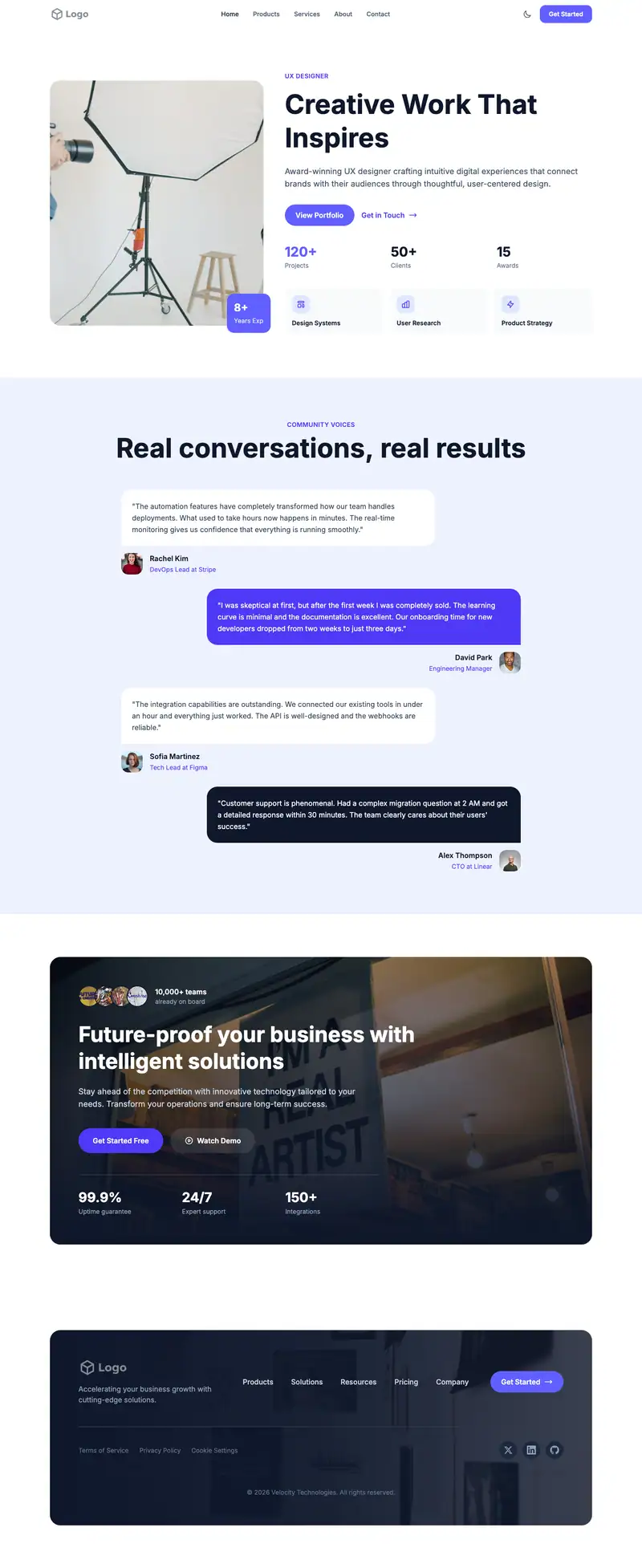
Bold Portfolio
FreeA bold portfolio landing page template from the Portfolio Creative collection, built with Tailwind CSS v4: navigation, hero, testimonials, call to action and footer, responsive at sm/lg/xl with dark mode.
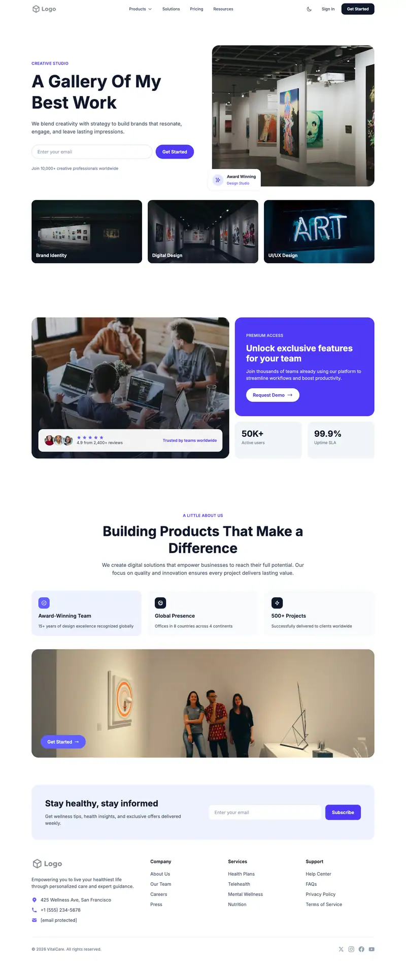
Gallery Focused Portfolio
FreeA gallery focused portfolio landing page template from the Portfolio Creative collection, built with Tailwind CSS v4: navigation, hero, call to action, about and footer, responsive at sm/md/lg with dark mode.
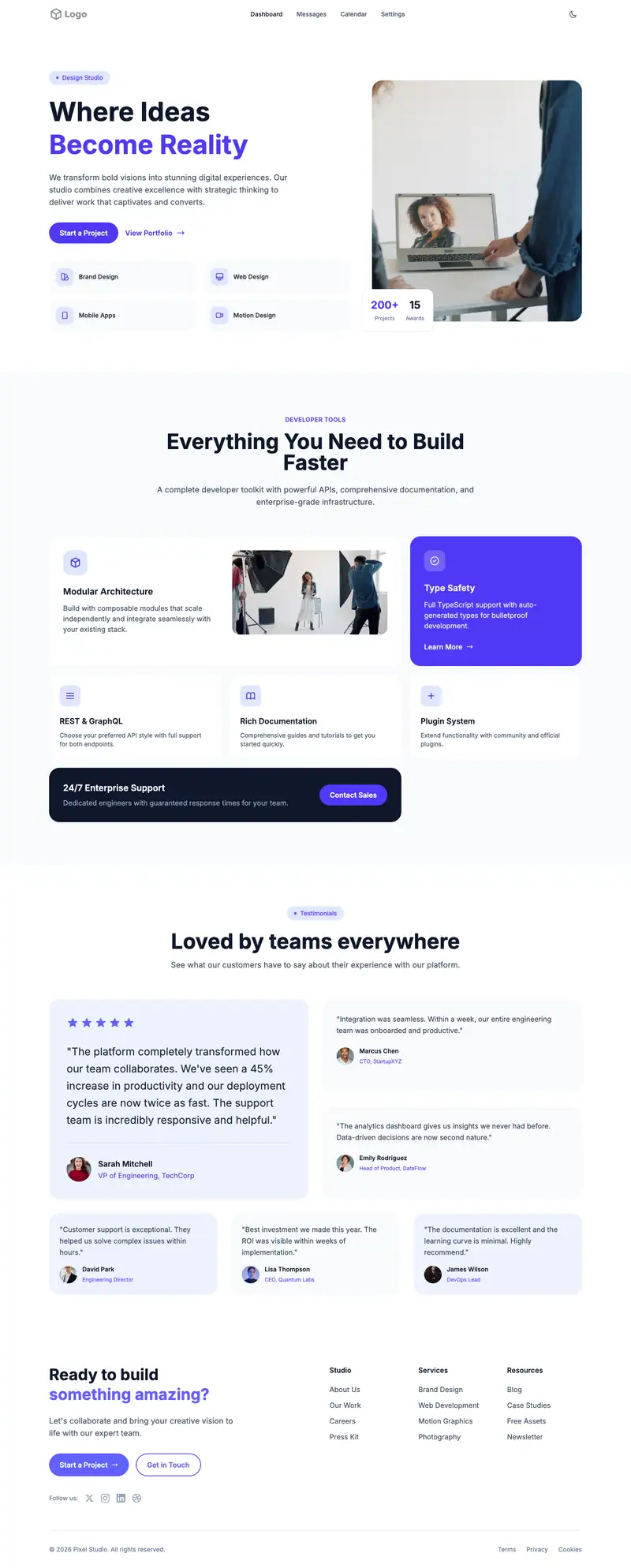
Photographer Portfolio
ProA photographer portfolio landing page template from the Portfolio Creative collection, built with Tailwind CSS v4: navigation, hero, features, testimonials and footer, responsive at sm/md/lg with dark mode.