Every SaaS product needs a pricing page. Here's how to build one with Tailwind CSS that includes a working monthly/yearly toggle, responsive cards, and proper dark mode support.
The Structure
A good pricing page has three parts: a header (title + toggle), pricing cards (2-3 plans), and a feature comparison (optional). Let's build each.
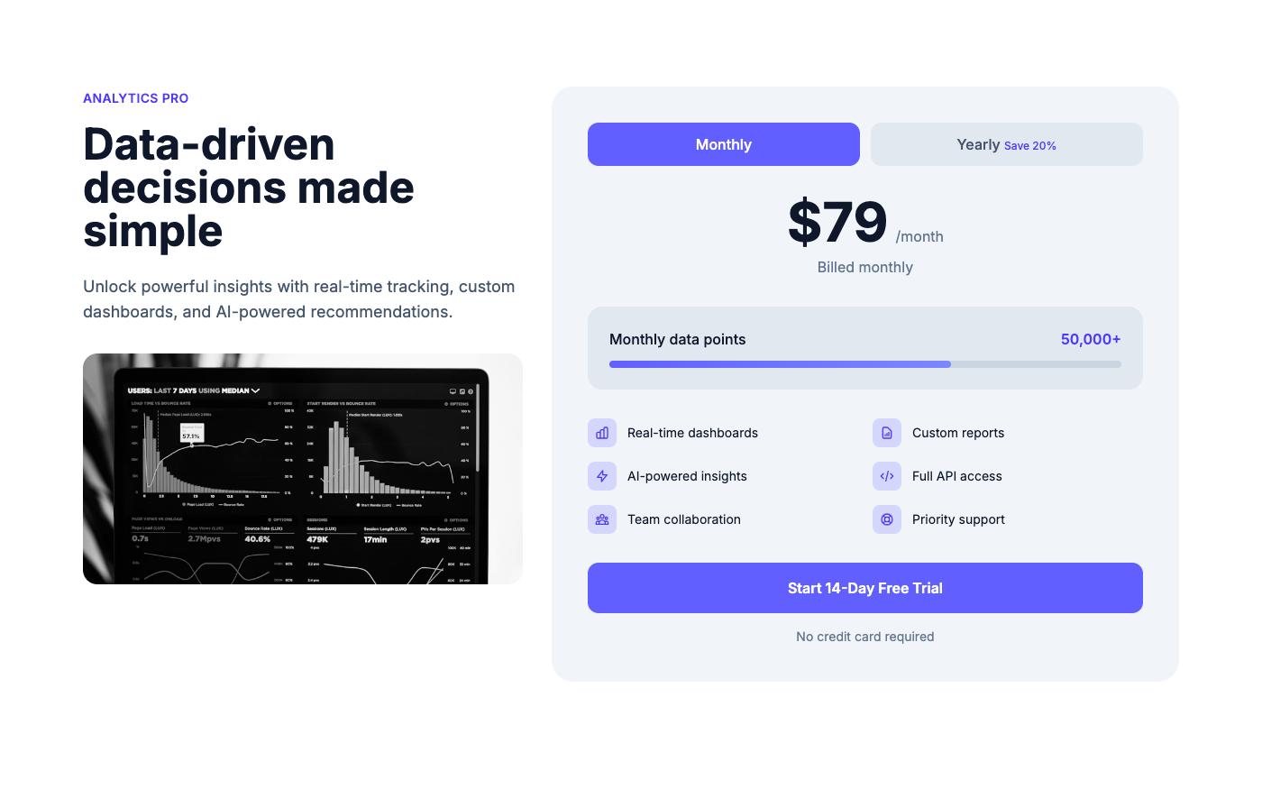
Step 1: The Toggle
Monthly/yearly pricing toggle with a "Save 20%" badge on yearly.
<div class="flex items-center justify-center gap-3">
<span class="text-sm text-neutral-600 dark:text-neutral-400">Monthly</span>
<button id="pricing-toggle" type="button" role="switch" aria-checked="false"
class="relative w-12 h-6 bg-neutral-200 dark:bg-neutral-700 rounded-full transition-colors">
<span class="absolute top-0.5 left-0.5 w-5 h-5 bg-white rounded-full shadow transition-transform"></span>
</button>
<span class="text-sm text-neutral-600 dark:text-neutral-400">Yearly</span>
<span class="text-xs bg-emerald-100 dark:bg-emerald-900/40 text-emerald-700 dark:text-emerald-300 px-2 py-0.5 rounded-full">Save 20%</span>
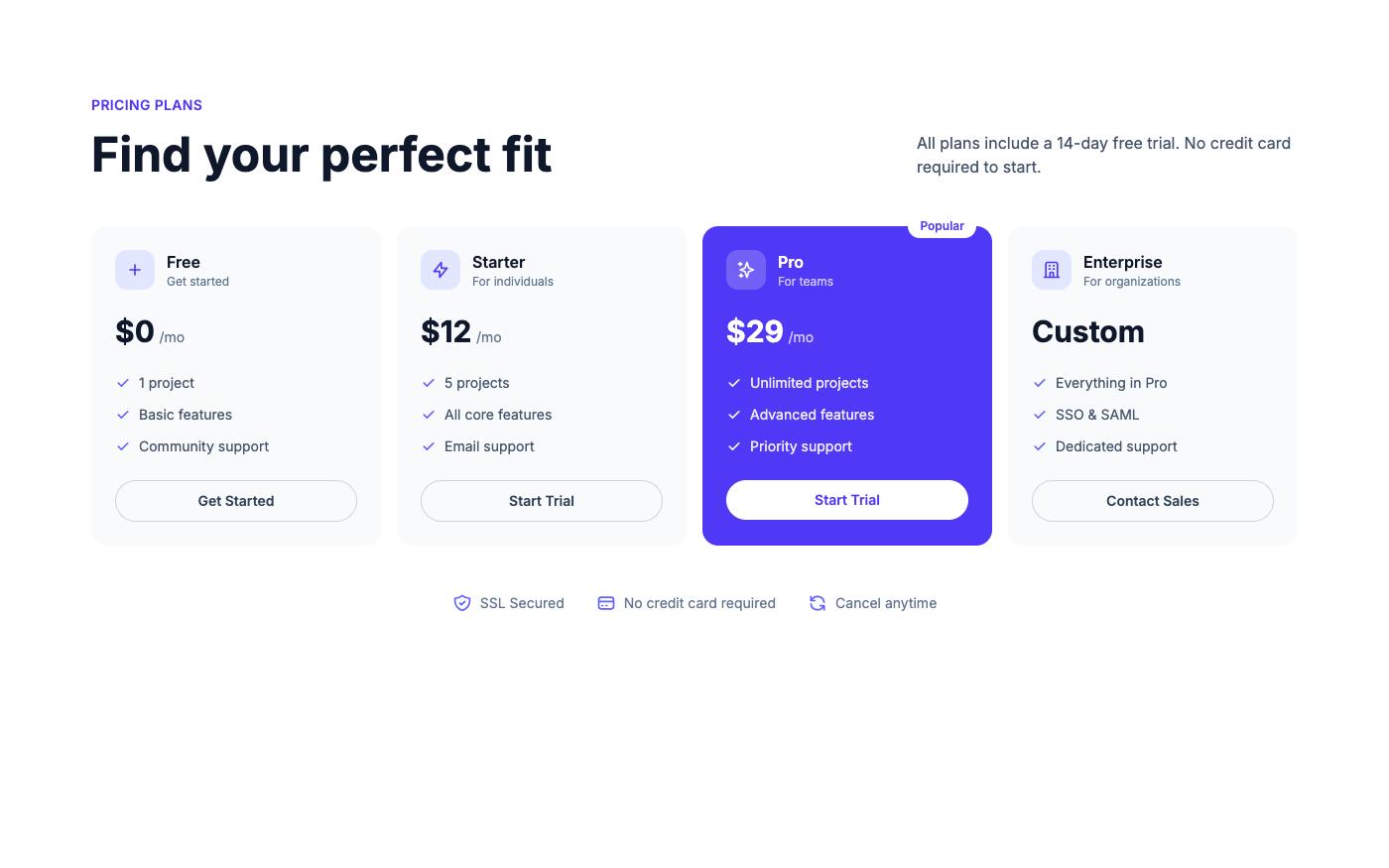
</div>Step 2: Pricing Cards
Three cards — Free, Pro (highlighted), and Enterprise. The highlighted card uses your accent color.
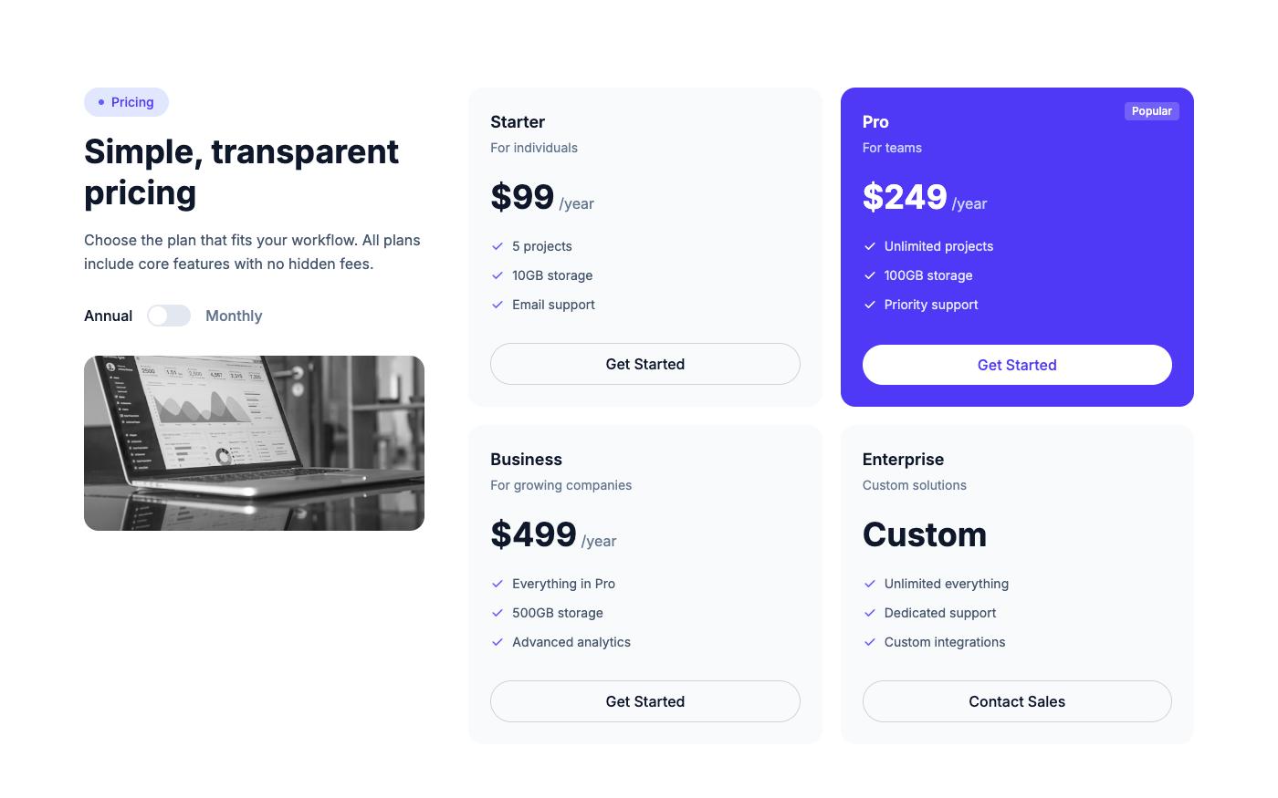
Key design decisions:
- Highlight the recommended plan with a colored border or background
- Show the price prominently with the billing period below
- List 4-6 features per plan — enough to differentiate, not enough to overwhelm
- Use checkmarks for included features, dashes or X marks for excluded
Step 3: The Toggle JavaScript
const toggle = document.getElementById('pricing-toggle');
const monthlyPrices = document.querySelectorAll('[data-price="monthly"]');
const yearlyPrices = document.querySelectorAll('[data-price="yearly"]');

toggle.addEventListener('click', () => {
  const isYearly = toggle.getAttribute('aria-checked') === 'true';
  toggle.setAttribute('aria-checked', !isYearly);

  // Toggle visual state
  toggle.querySelector('span').style.transform =
    !isYearly ? 'translateX(24px)' : 'translateX(0)';
  toggle.style.backgroundColor =
    !isYearly ? 'rgb(99 102 241)' : ''; // indigo-500

  // Toggle prices
  monthlyPrices.forEach(el => el.classList.toggle('hidden', !isYearly));
  yearlyPrices.forEach(el => el.classList.toggle('hidden', isYearly));
});
More Pricing Layouts
Not every product fits the 3-card layout. Here are alternatives:
💡 Pro tip: Always show the yearly price as a monthly equivalent (e.g., '$8/mo billed annually') — it looks cheaper and converts better than showing the full annual price.
All pricing blocks shown here are available on OpenTailwind with full dark mode support and working toggles.